Vincent Flanders and his site that teaches what sucks!
I enjoyed watching the video excerpts immensely. I wonder sometimes if designers don't get caught up in the "look what I can do" state of mind. I think that basically what Flanders (and Nielson for that matter) was trying to say is that just because you can do something doesn't mean you should. I really liked the site he showed for Ear Shades I think it was, it was a completely black screen and your cursor acted as a flashlight until you clicked and the whole thing came into view. I thought that was neat but he was right, if I went to a site and it turned out to be a black page I would think there was something wrong with it and go somewhere else. Internet users are not a patient group. We want innovation that is going to make our experience cleaner quicker and easier, not some flashy coding that is used so the designer can pat himself (or herself) on the back because he is so clever. Web design, especially commercial web design needs to make sense for the end user. Flashy razzle dazzle is meaningless and a waste of time unless it is going to enhance the user experience without sacrificing speed and ease of access.
skip to main |
skip to sidebar
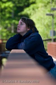

Looking up to brighter days!
CAT274 Web Design
Followers
Blog Archive
-
▼
2009
(42)
-
▼
February
(17)
- Classwork...Here's the link to my navbar.I thought...
- Texture, according to Jason Beaird.Overall, I real...
- This one was entertaining. Rollover images. Much...
- Here are my banner designs.... first drafts of cou...
- Vincent Flanders and his site that teaches what su...
- So about our final project. I've had an idea for ...
- Perhaps a bit late but I still wanted to comment o...
- I've just read the chapter on color. In compariso...
- I got through the classwork easily enough, only a ...
- Lesson 4I'm not sure if this was an easy chapter o...
- Here's how Chapter 3 turned out. I had a bit of ...
- Classwork, week 3! This was fun, I played with th...
- I read the first chapter of Jason Beaird's The Pri...
- Creating a Site... (ooooh, ahhhh)Here is the resul...
- So I've covered a lot of ground this week... as al...
- So about these sites we're experimenting with..I s...
- I actually finished most of this sometime last wee...
-
▼
February
(17)
About Me

- VCBandura
- I'm just a girl trying to be better. I work way too hard, and sleep way too little.
"just because you can do something doesn't mean you should."
ReplyDeleteyou hit the nail on the head :)